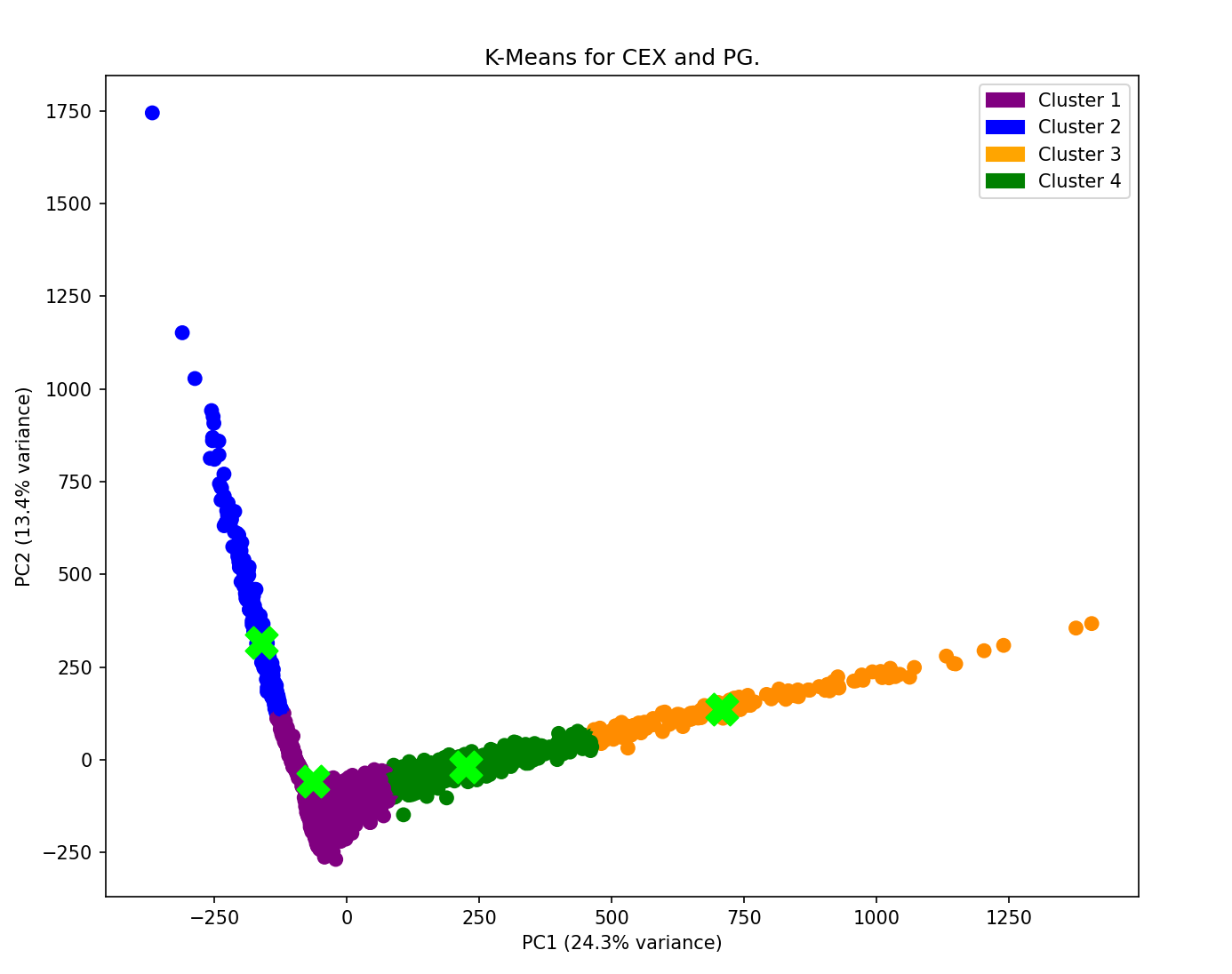
I added this K-means plot to the Georgia Project. The cephalexin and phenylglycine images used for the plot were part of a binary classification project – but, after some testing, they fell neatly into four clusters, as seen below.
For more on the OpenCrystalData dataset, Crystallization impurity detection | Kaggle
For more on the Georgia Project, including this K-means plot, see GitHub - KatherineMossDeveloper/The-Georgia-Project: Study of the cropped images in the OpenCrystalData dataset on Kaggle
Cheers,
Katherine
That’s a really interesting observation! Even though the original task was binary classification, the emergence of four distinct clusters through K-means suggests there might be hidden patterns or subgroups within the cephalexin and phenylglycine images possibly related to variations in structure, concentration, or experimental conditions.
I decided to do K-means on the images as an academic exercise, but then I saw, when doing 4 centroids, that the phenylglycine divided itself into 3 groups, while the cephalexin did not. That teaches me that being ‘academic’ can lead to understanding.
As you point out, I am curious about the differences in things like experimental conditions; however, the only information I have from the dataset is the date and time stamp in the image files. The first PNG image file that I extracted information from said that it was create shortly before midnight, so perhaps the experimental condition was that the operator had a lot of coffee. 
Cheers,
Katherine
1 Like