From the classification application of AI algorithms, I have some idea about the boundary line or decision line in logistic regression, etc. However I am not sure that I got it for the NN. In the assignment I saw boundary lines and they were different (okay slightly and not visible) in different number of activations or nodes in the hidden layer. So my question how it is drawn? I assume NN works like a black box so we make boundary lines based on the available data, or?
I am mainly seeing NN and Deep learning for classification. How about the Regression applications? In the course I couldn’t see anything on it. Reason is this application is far different (away) from classification or they are identical? I would love to get some direction for NN and Deep Learning for Regression Applications too.
Thanks in advance!
Re: Your question 2:
Yes, you can have an NN with a linear output. They’re not discussed in any of the courses.
The cost function is the same as for linear regression.
Backpropagation is more complicated because of the hidden layer.
The hidden layer will typically will use a tanh() or ReLU activationU). This is because we want the hidden layer to support all real values (not just using sigmoid with a range of 0 to 1).
We don’t really need boundary lines. Often you won’t be able to visualize one, because the number of input features could be very large. There is no way to make such a complicated plot.
If you’re predicting labels or classifications, the output chosen is the unit with the highest activation value.
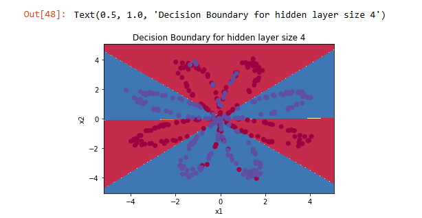
Course 1, in Deep Learning Specialization, Assignment for Week 3. In the end we got some colors identical to classes (unlike logistic it was not continuous and I was wondering how it was plotted).
The code for that plot is in the “planar_utils.py” file, which is imported in the first cell in the notebook.
You can find it using the File->Open menu.
The code in plot_decision_boundary() works like this:
It defines a grid of values for x1 and x2, covering the entire graph.
For each (x1, x2) pair, it uses the learned weight and bias values from the model, and computes a single prediction point.
For each point, if the value is >= 0.5, then it shades that point blue. If the value is < 0.5, then it shades that point red. This matches the color scheme for the dataset.